The headline fix — conversation on mobile
The old screen stacked three nav bars, a four-row header, and a nested suggestion drawer on top of the feed — leaving room for ~2 bubbles. The redesign collapses all of that.
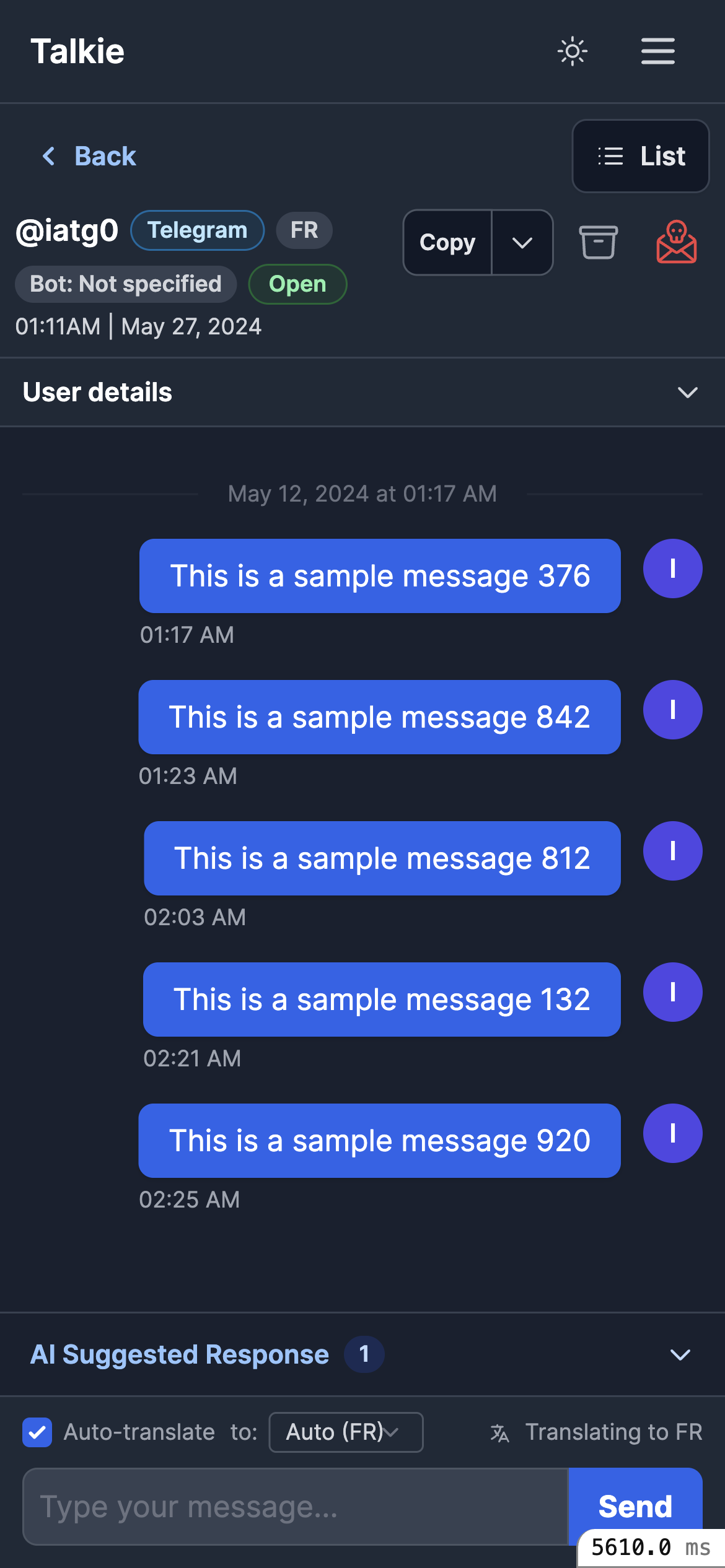
Triple navigation (app bar + Back + List), a 4-row header, a loud red spam icon, and a nested drawer where Accept/Reject sit above the text. The feed is squeezed.
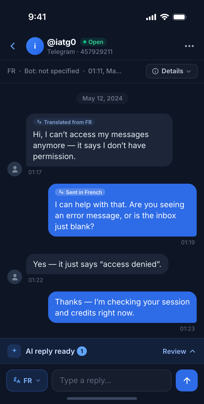
One contextual bar, a 2-row header with a collapsed Details, a slim inline-translate composer, and the feed grows from ~190px to ~470px. Bubbles win.
Conversation show · 4 states
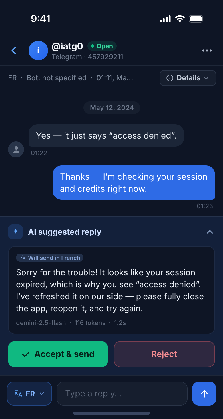
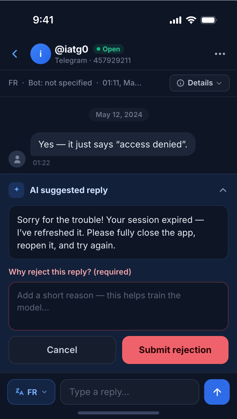
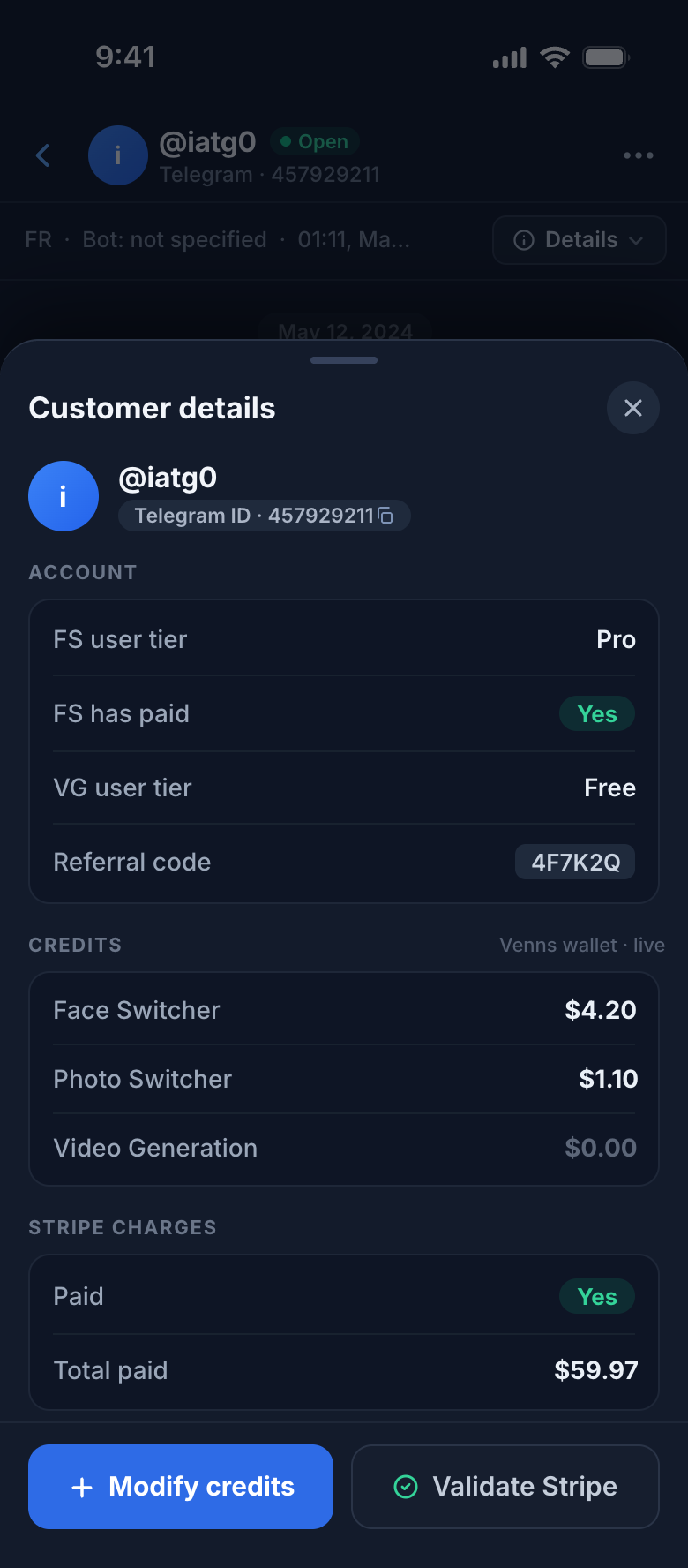
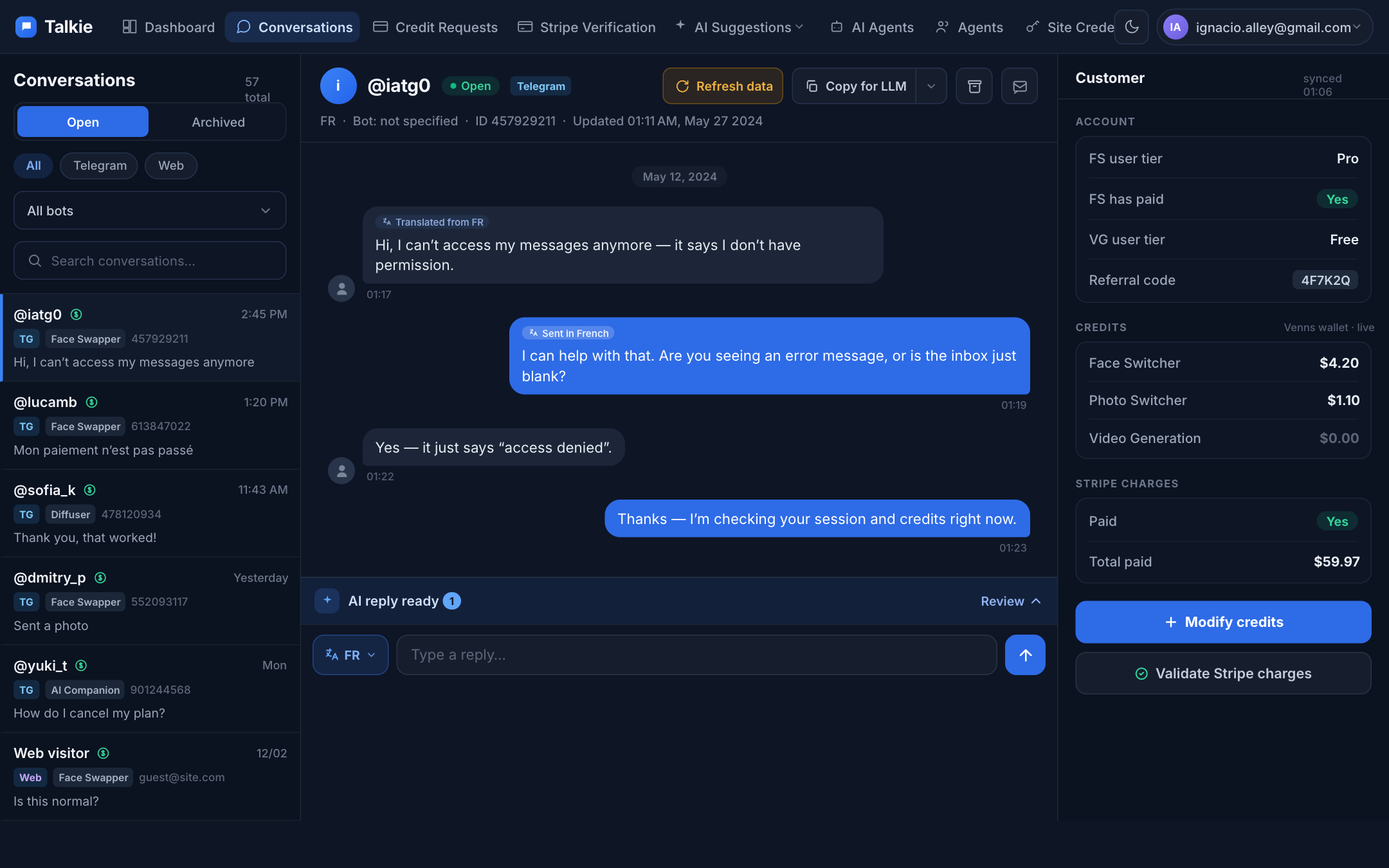
The suggestion drawer is un-nested — text first, then equal Accept / Reject. Customer details become a dismissible bottom sheet over a dimmed feed, never a permanent space-hog.
Navigation & the list
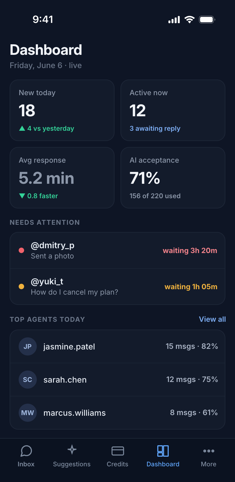
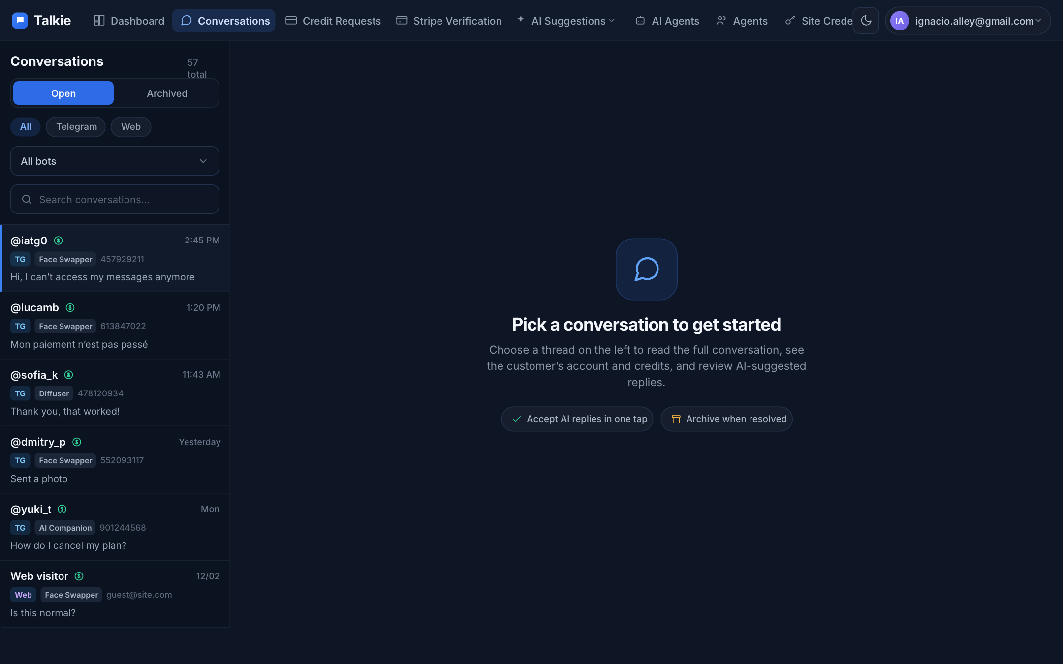
The old index hid the conversation list behind a “Browse conversations” button over an empty dashboard. Now the list is the screen, with a thumb-friendly bottom tab bar instead of a hamburger.
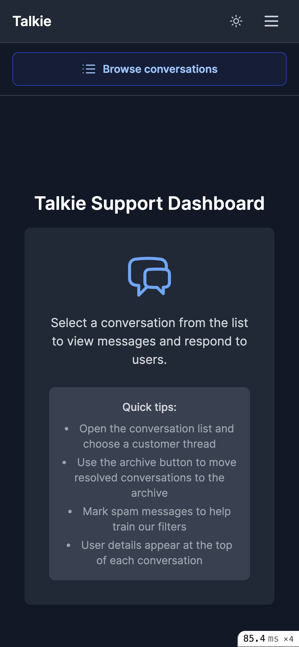
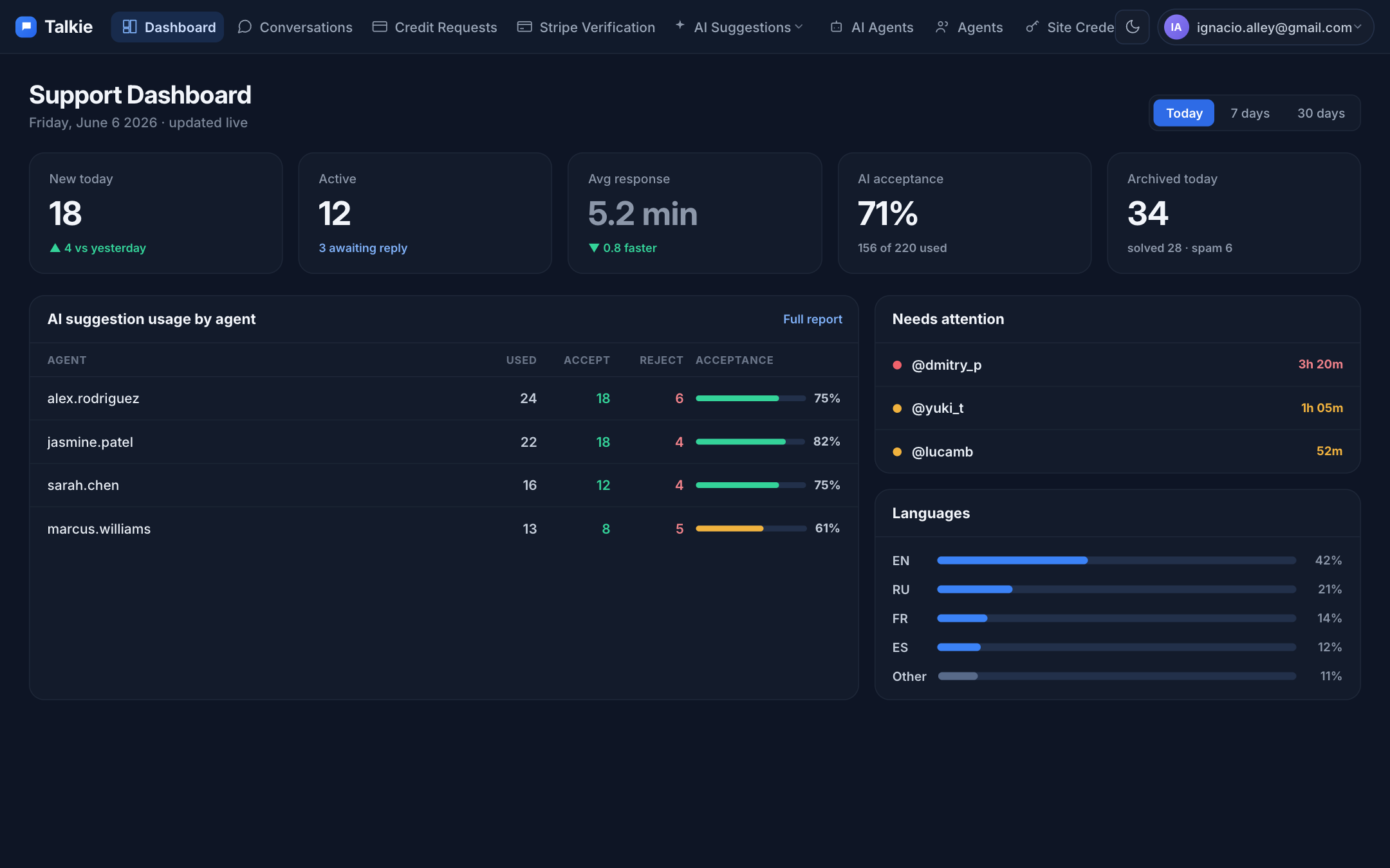
List hidden behind a button; an empty “Support Dashboard” fills the screen.
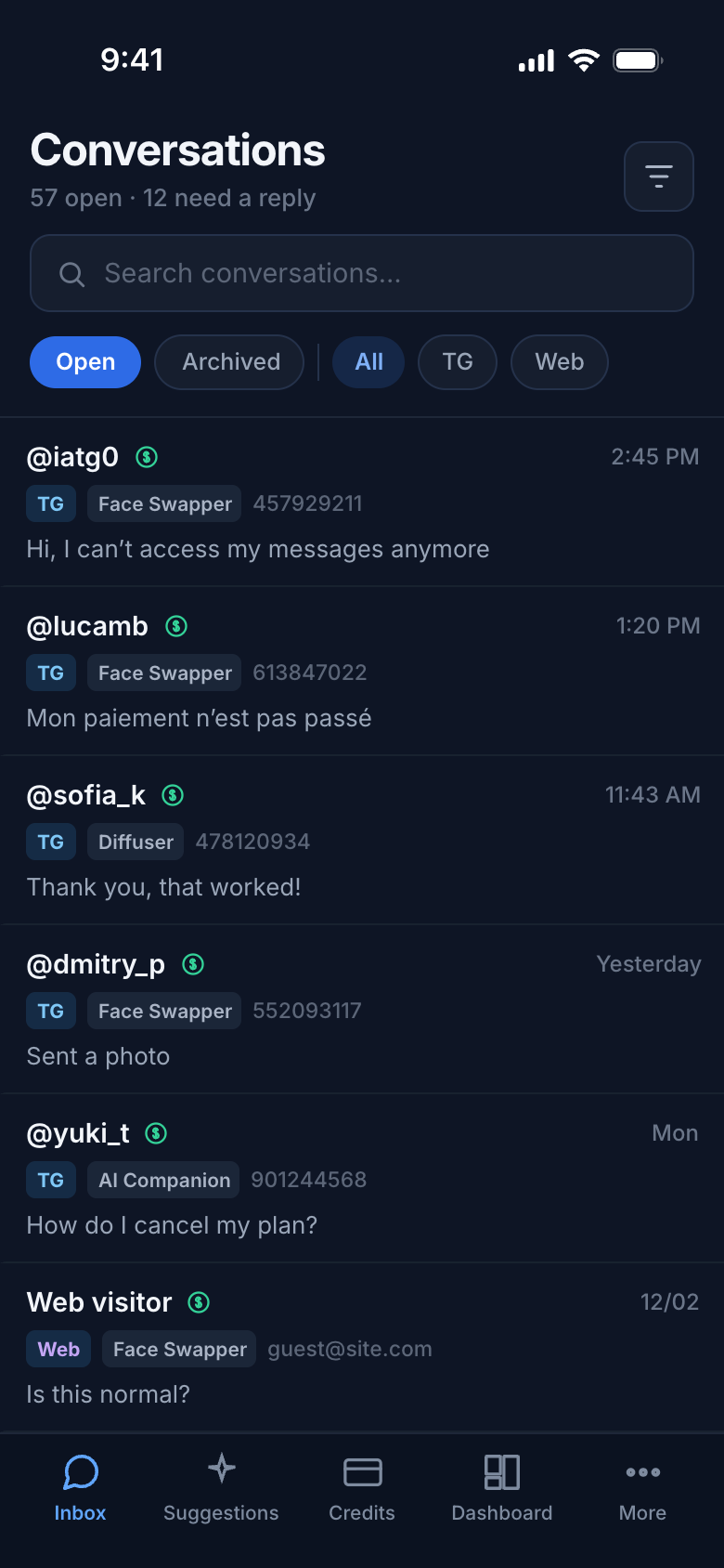
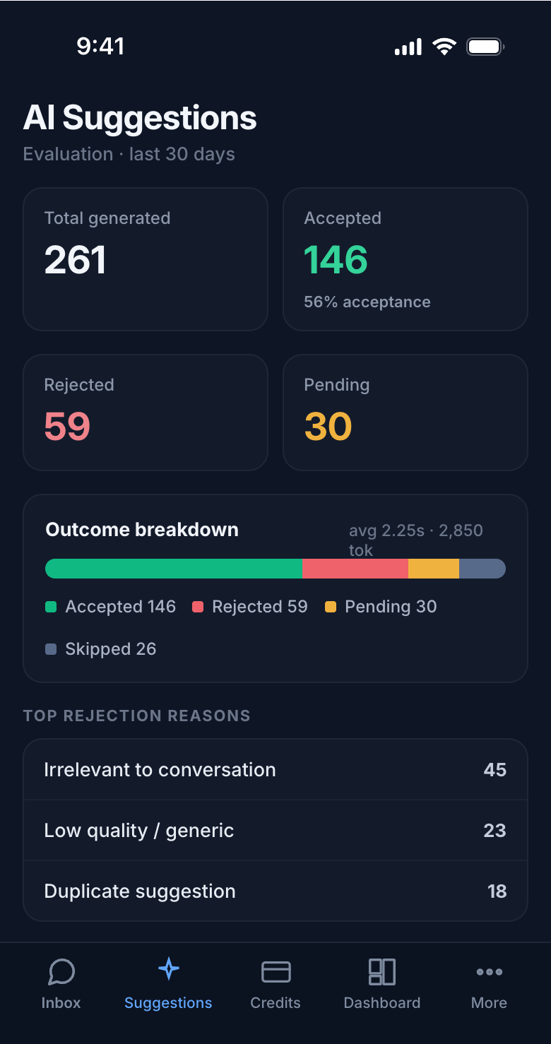
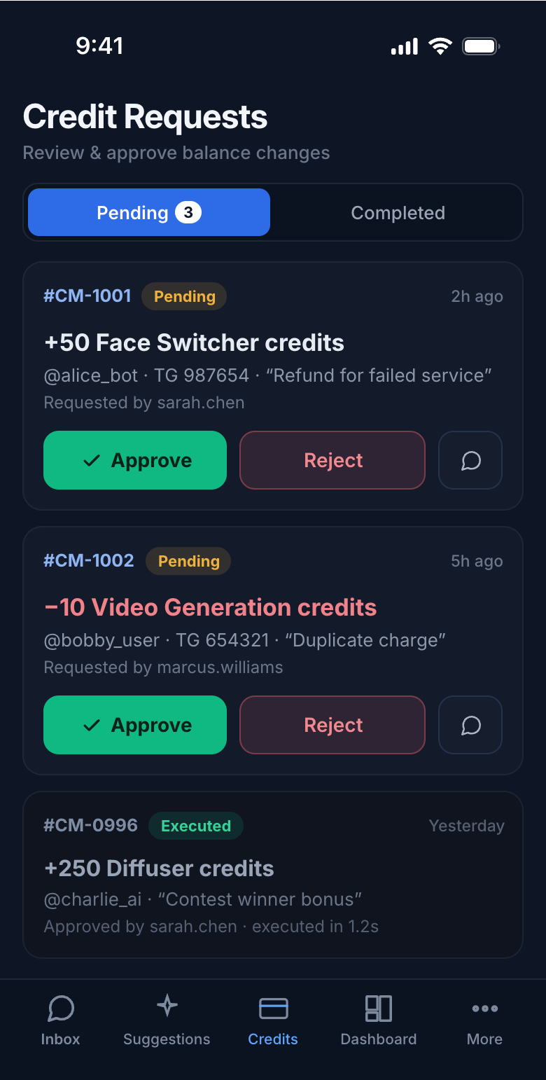
Search, filters, and a scannable list up front; global nav in a bottom tab bar.
Every other view · mobile
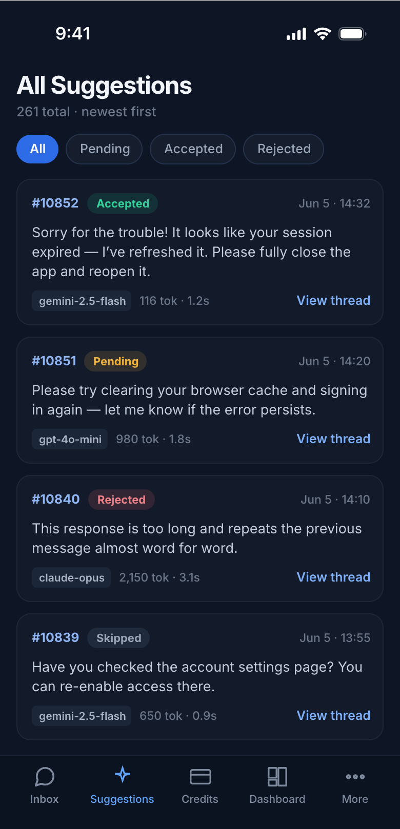
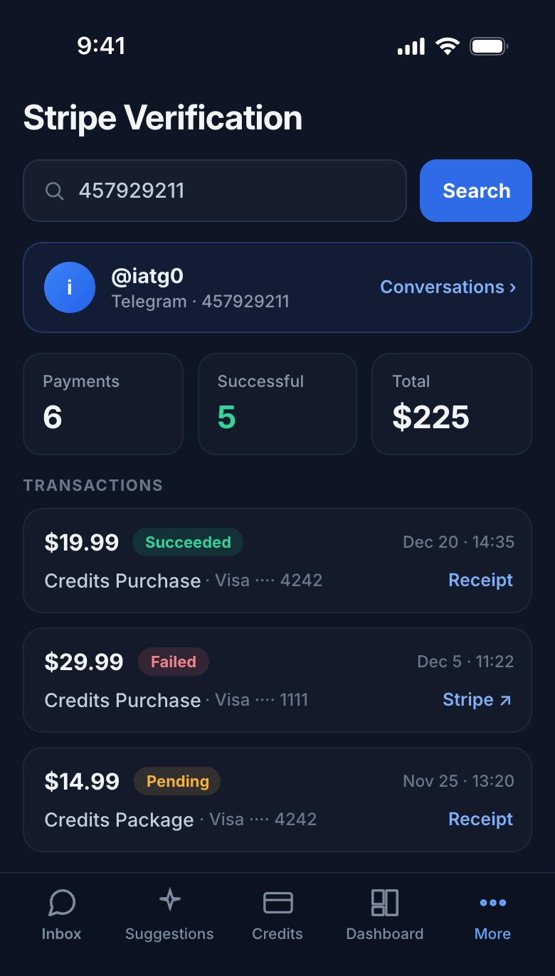
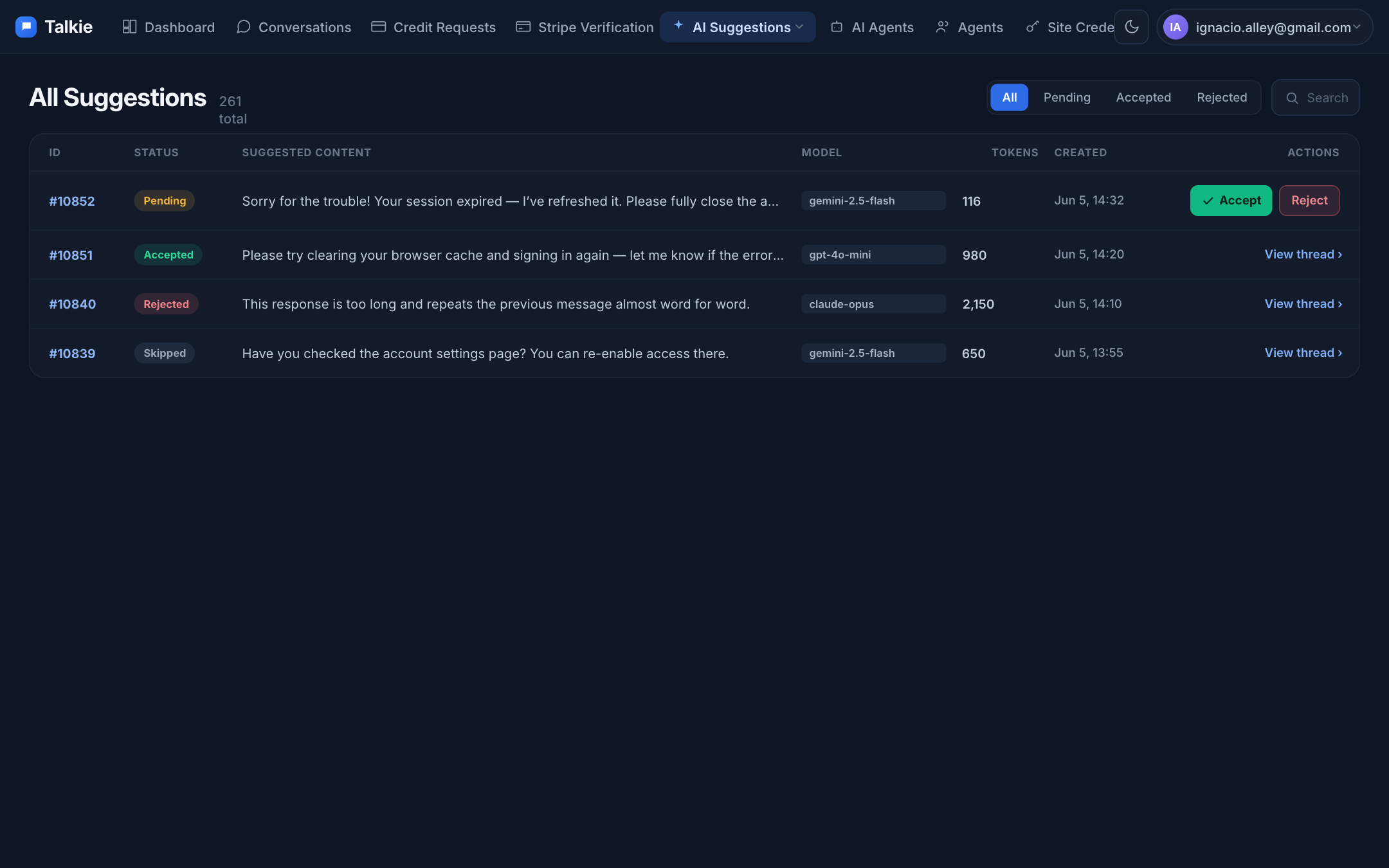
The recurring bug across the app — 6-to-8 column tables that scroll sideways on a phone — is replaced everywhere with scannable stacked cards.

Desktop
The same maritime-ink system on the wide layout — a refined three-pane conversation, a calmer empty state, and tables that breathe.
What changed, in short
✓ One nav, not three
App bar + Back + List collapse into a single contextual bar on detail screens.
✓ Feed owns the screen
Condensed 2-row header; user info moves to a dismissible sheet.
✓ Suggestions un-nested
Read the reply first, then Accept / Reject as equal, full-size buttons.
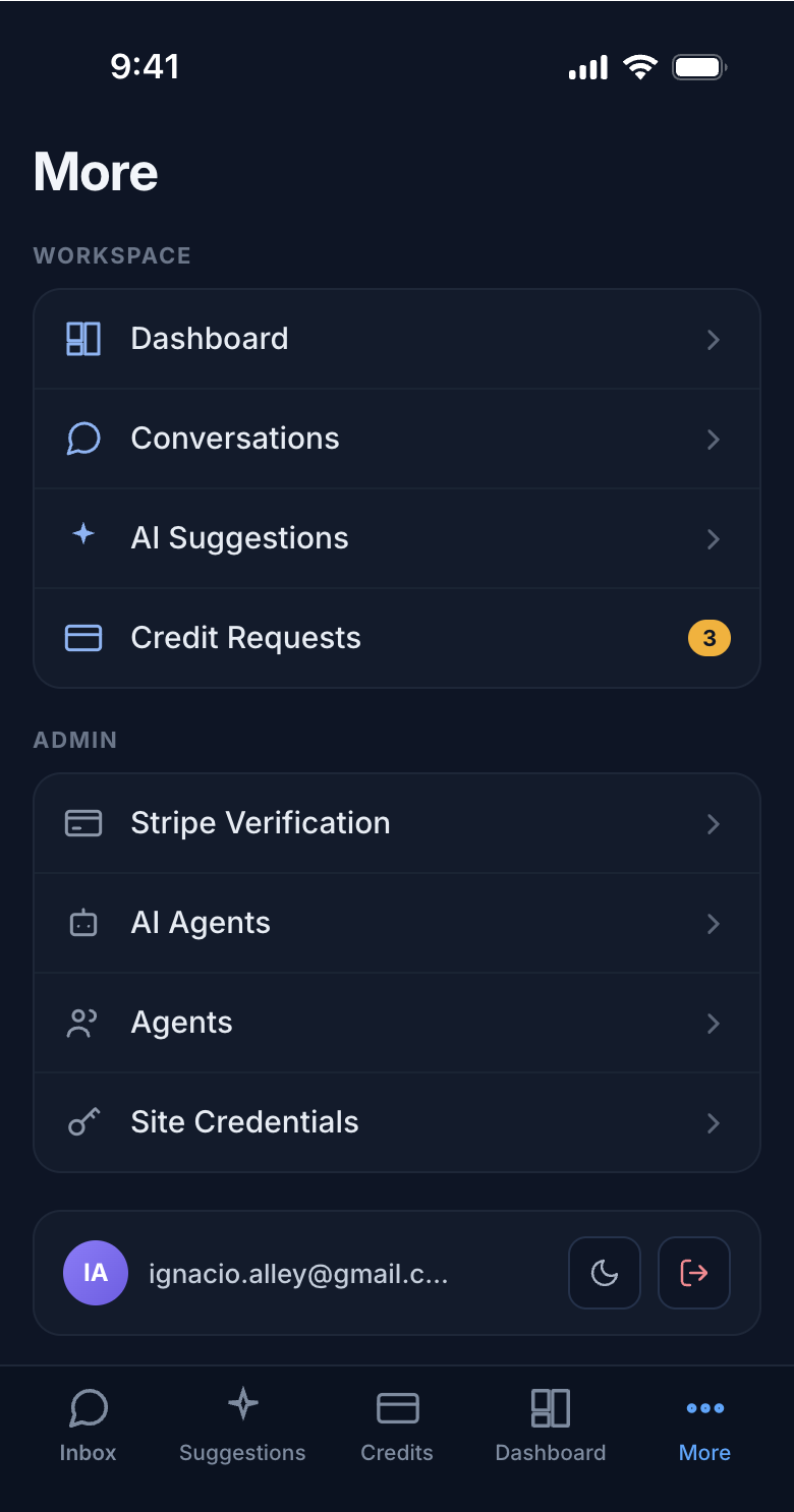
✓ Bottom tab bar
Thumb-reachable global nav replaces the hamburger + “Browse” detour.
✓ Tables → cards
No more sideways-scrolling 8-column tables on a 390px screen.
✓ Calmer palette
Maritime-ink ground, one blue accent, disciplined emerald / rose / amber.